Flexible work meets real-time staffing.
TEMPO connects students looking for flexible work with hospitality businesses that need reliable staff at short notice.
Designed as a two-sided mobile platform, it brings availability, shift matching and attendance into one connected experience.

ROLE
UX / Product Designer
PROJECT
Noroff Final Exam
PLATFORM
Mobile
SCOPE
Research · UX · Prototype · Testing
TOOLS
Figma · Visily · Useberry · Survey Monky · Canva

Understanding both sides of the shift.
TEMPO had to work for two very different users: students looking for flexible work around their studies, and hospitality businesses needing reliable staff at short notice.
Research with both groups revealed four recurring needs that shaped the product: flexibility, speed, trust and transparency.
Two different users.
One connected problem.
THE CHALLENGE


THE OPPORTUNITY
How could TEMPO connect the right student with the right shift at the right time — without sacrificing flexibility, speed or trust?
THE CHALLENGE
TWO USERS. ONE CONNECTED PROBLEM.

FLEXIBILITY
STUDENT
Students need work that adapts around lectures, exams and changing availability.
SPEED
BUSINESS
Unexpected staffing gaps require reliable workers at short notice.
CONNECTING BOTH SIDES
OPPORTUNITY
How could TEMPO connect the right student with the right shift at the right time — without sacrificing flexibility, speed or trust?

UNDERSTANDING THE PROBLEM
I started by understanding both sides of the marketplace.
Rather than designing only for students looking for work, I also explored the needs of the businesses creating those opportunities.
Using surveys, interviews, competitor analysis and desk research, I looked for where the needs of both groups intersected.
RESEARCH METHODS
Interviews · Survey · Competitor analysis · Desk research
FROM INSIGHT TO DIRECTION

WHAT I LEARNED
Flexibility alone wasn’t enough.

Research revealed four key themes that needed to work together for TEMPO to feel useful for both students and businesses.
FLEXIBILITY · SPEED · TRUST · TRANSPARENCY → PRODUCT DIRECTION
FLEXIBILITY
Students need work that adapts to their studies.
Changing lectures, exams and study periods make fixed schedules difficult.
TRUST
Businesses need confidence in who they bring into a shift.
Experience, qualifications, availability and reliability help reduce uncertainty.
SPEED
Businesses need to respond quickly when staffing gaps appear.
Unexpected absences and changing demand make traditional recruitment too slow.
TRANSPARENCY
Both sides need clear information before committing.
Role, time, location, pay and requirements should be easy to understand.
DESIGNING FOR BOTH SIDES
One marketplace, two experiences.
TEMPO needed to support two different journeys within the same system. I designed each side around its own priorities while keeping the experience connected through flexibility, trust, clear information and reliable matching.
PRODUCT PRINCIPLES
Flexibility · Trust · Clear information · Reliable matching

STUDENT
Can I fit this shift around my studies?
The student experience is built around flexibility and clarity. Students can set their availability, discover suitable shifts, understand requirements and follow each shift from application through completion.

BUSINESS
Can I find someone reliable quickly?
The business experience focuses on speed and control. Businesses can create urgent shifts, review suitable workers, manage attendance and complete the shift and feedback process within one connected flow.
FROM RESEARCH TO PRODUCT DIRECTION
I explored three ways TEMPO could solve the problem.
Each concept focused on a different research need: speed, trust or flexibility.
SPEED - Smart Radar
Real-time shift alerts and fast applications for urgent opportunities.
TRUST - Verified Trust Pool
Experience, qualifications, ratings and reliability help businesses evaluate workers with more confidence.
FLEXIBILITY - Semester Block Marketplace
Availability adapts around lectures, exams and changing study periods.
SELECTED DIRECTION - Schedule-First Shift Marketplace
A two-sided experience built around flexibility, speed, transparency and trust.
Turning the concept into two connected journeys.
BUILDING THE PRODUCT
Once the direction was defined, I translated it into features, user flows and information architecture for both sides of the marketplace.
STUDENT
Set availability → Find shift → Apply → Complete shift
BUSINESS
Identify need → Post shift → Select worker → Manage shift

Information architecture connecting Student, Business and shared system features.
DEVELOPING THE EXPERIENCE
From structure to interaction.
I moved from early wireframes into increasingly detailed prototypes, refining hierarchy, navigation and the actions required to complete a shift.
KEY DESIGN PRINCIPLE
Make the next action clear.
Across both sides of TEMPO, each state needed to clearly communicate what had happened and what the user should do next.


FINAL EXPERIENCE
A connected experience from availability to completed shift.
The final design supports both sides of the marketplace, from finding and filling a shift to attendance, feedback and payment.
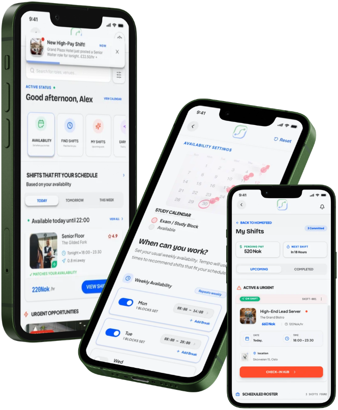
STUDENT
Flexible work around study schedules
Discover shifts, manage availability and follow the journey from application to completion.
BUSINESS
Fast staffing when gaps appear
Create urgent shifts, review workers and manage attendance through the same connected system.

TESTING & ITERATION
Completion wasn't the whole story.
I tested the core journeys with 20 participants and looked beyond task completion to understand how much effort each journey required.

10 STUDENTS 10 BUSINESSES
RESULTS
BUSINESS SETUP
Too many interactions
Account setup and urgent-shift creation created the most noticeable interaction cost.
STUDENT JOURNEY
Clearer next actions
The full shift journey could be more linear, with clearer status and next steps.
AVAILABILITY & ATTENDANCE
Information needed greater clarity
Calendar controls needed refinement, while attendance information needed to be easier for businesses to scan.
A successful journey isn't just one that users can complete. It should also feel clear, efficient and predictable.

OUTCOME & REFLECTION
Future iterations would focus on simplifying business setup and urgent-shift creation, clarifying the student journey, and improving availability and attendance information to make the overall experience faster, clearer and more predictable.
NEXT STEPS


DESIGN SYSTEM


Designed for clarity on both sides.
TEMPO uses a shared visual system across the student and business experiences, while blue and green help distinguish actions, states and user journeys.
Consistent typography, components and interaction patterns keep the experience familiar as users move from finding or posting a shift to attendance and completion.
One system. Two user journeys.

